Kegelness is an innovative, healthcare startup project I had the chance to be part of. Founded by two visionary Swiss siblings, the digital platform aims at sensibilizing audiences on pelvic floor implications, issues, and solutions.
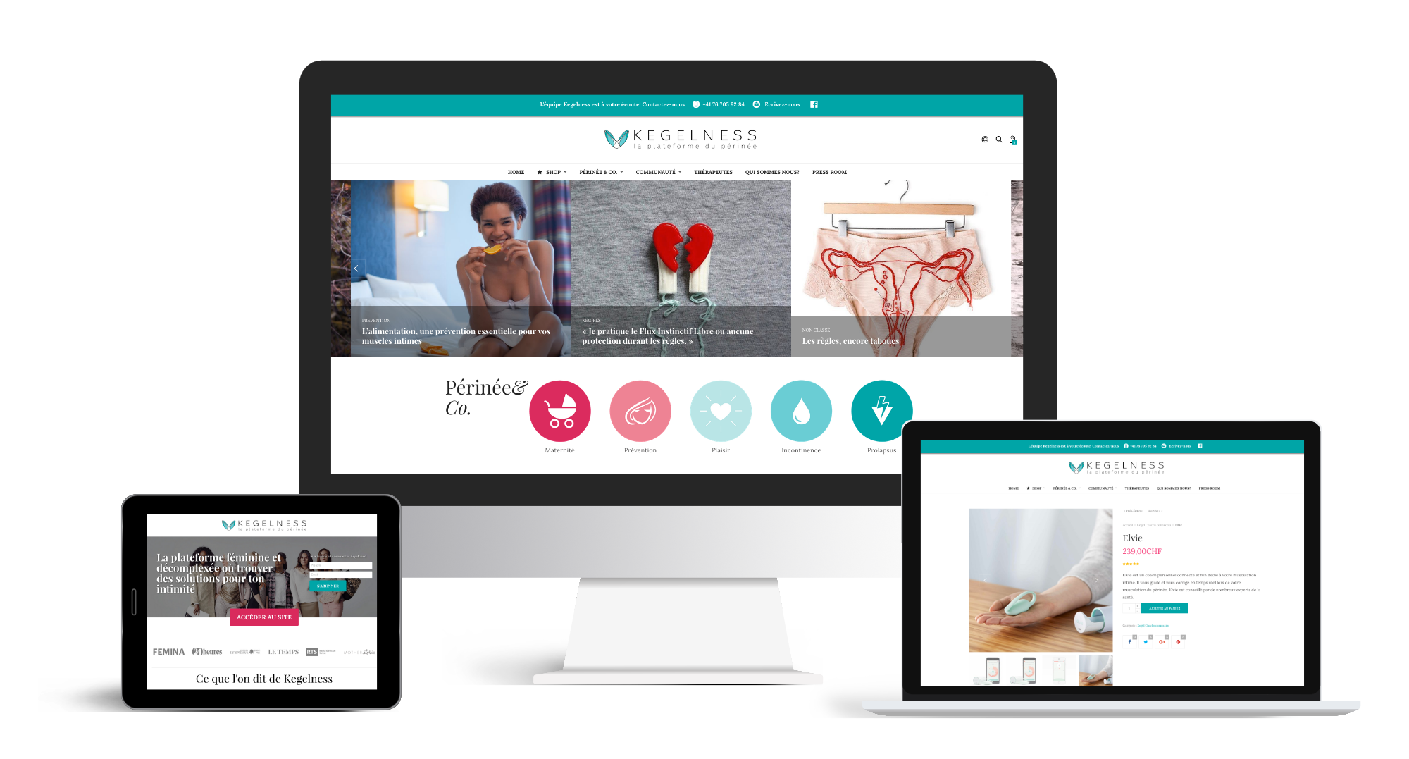
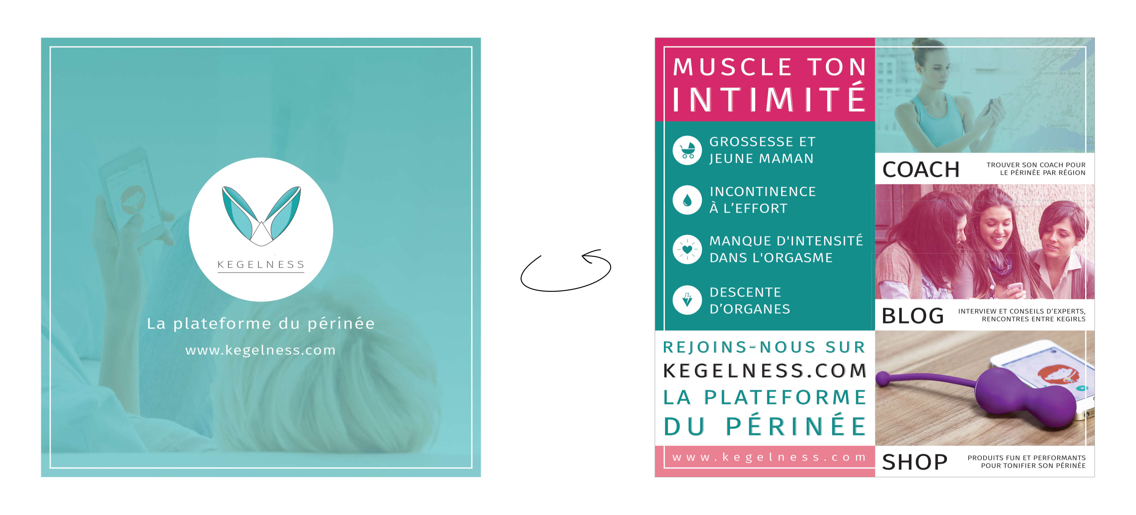
Going across several topic-related studies and market researches, and having clear in mind what the company’s purpose was, I’ve designed the the brand identity and created a wide range of communication supports: logo, color palette, typography, business cards, email signatures, keynotes, newsletters, expo stands, and flyers.
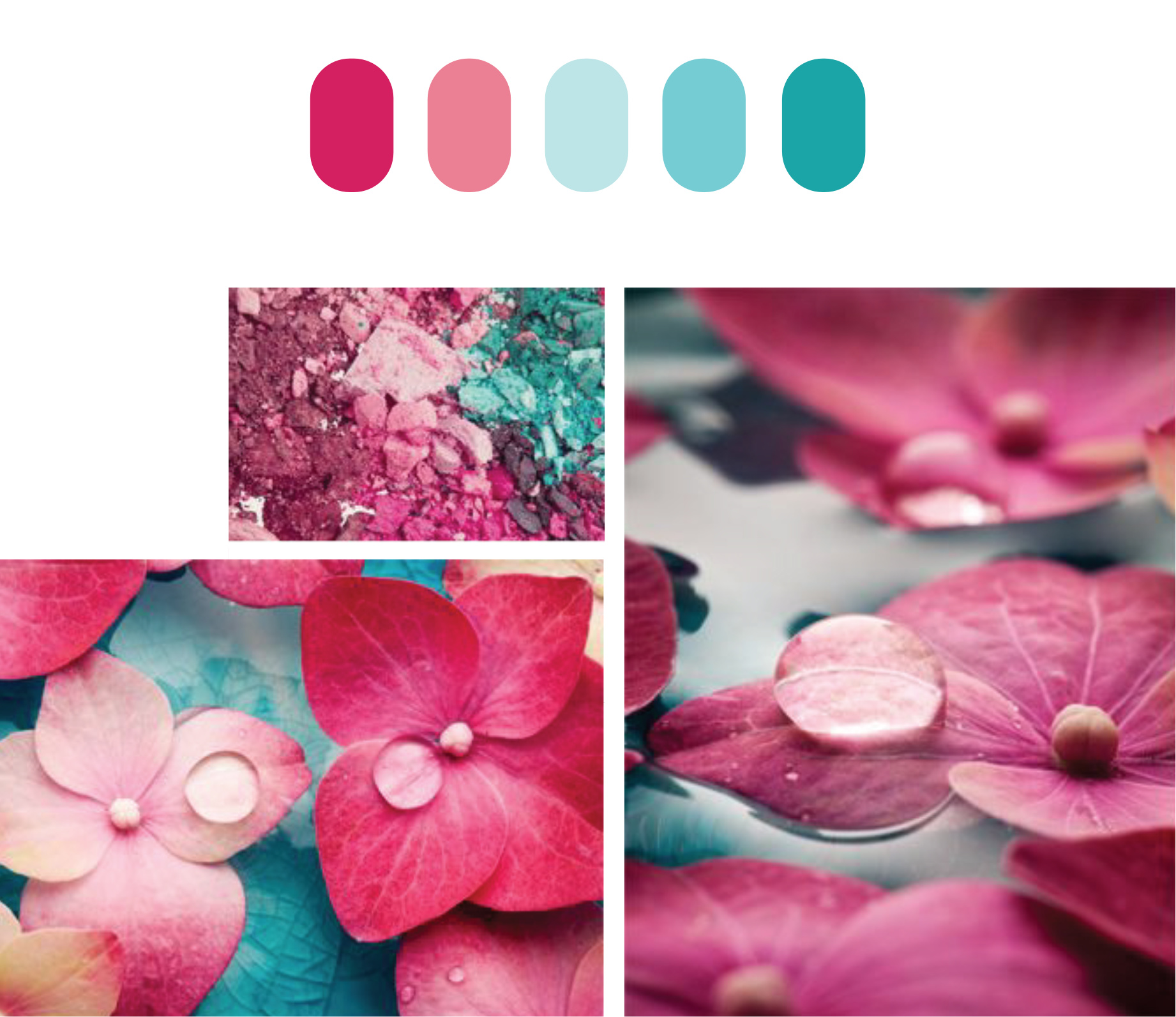
The choice of colors has been made with a purpose: I wanted them to be able to speak to women as well as men, to be perceived as associated to the healthcare system while remaining fun and entertaining, and to be recognizable as a separate entity.

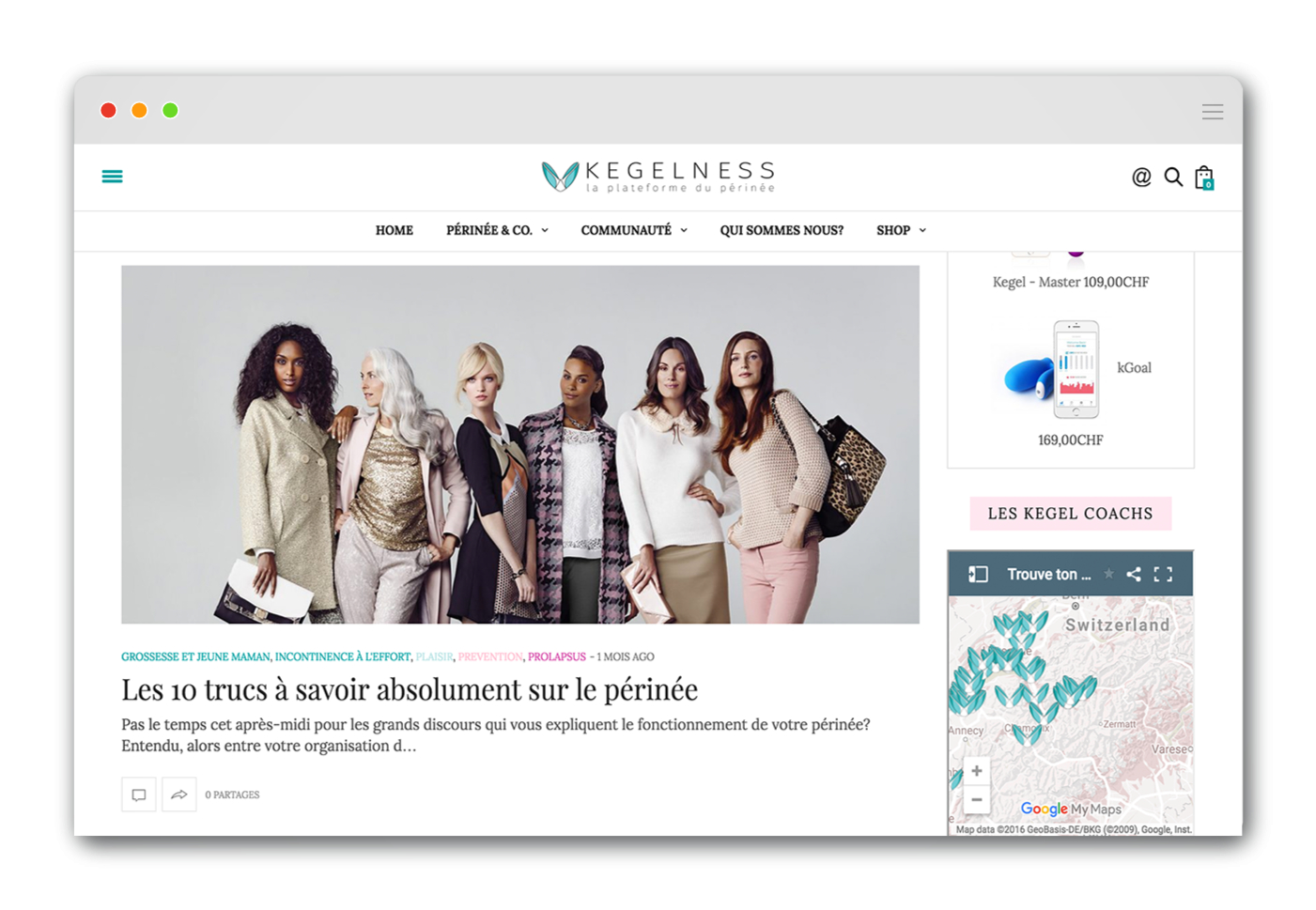
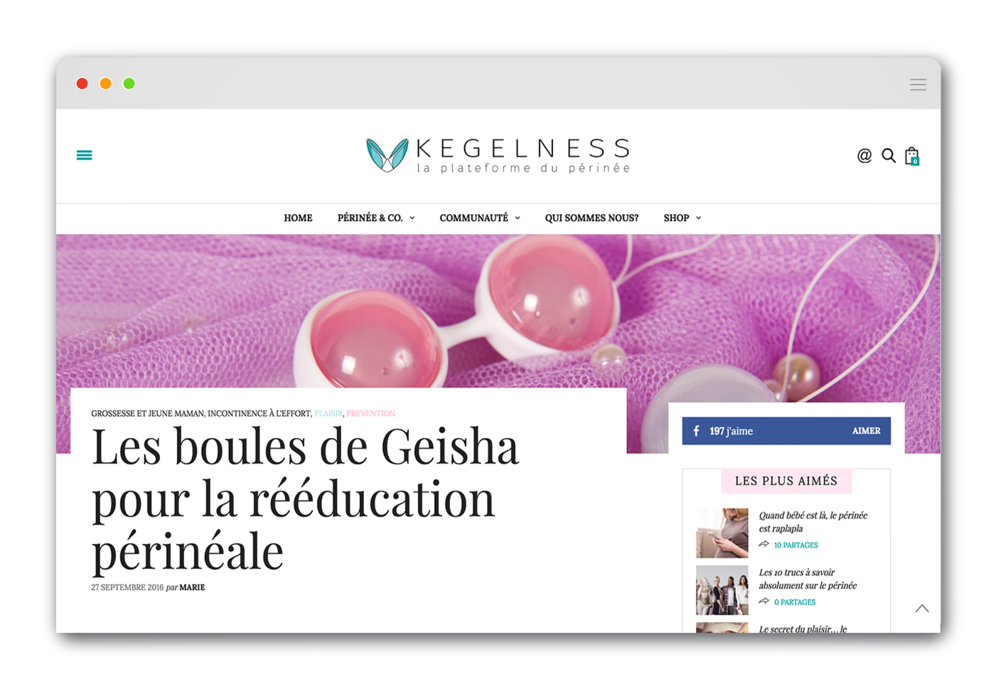
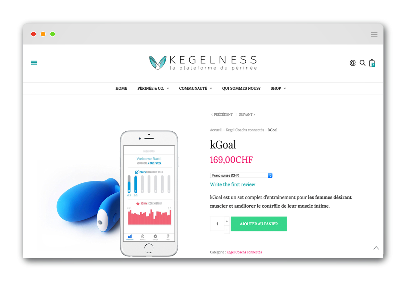
While helping to outline the digital strategy, I built the Kegelness website: an interactive digital platform that provides authoritative informations as well as a selection of the best tested products on the market, and that represents a place where people and healthcare professionals can finally talk about pelvic floor issues.
The platform is currently available in French, and it’s translation-ready for English and German.
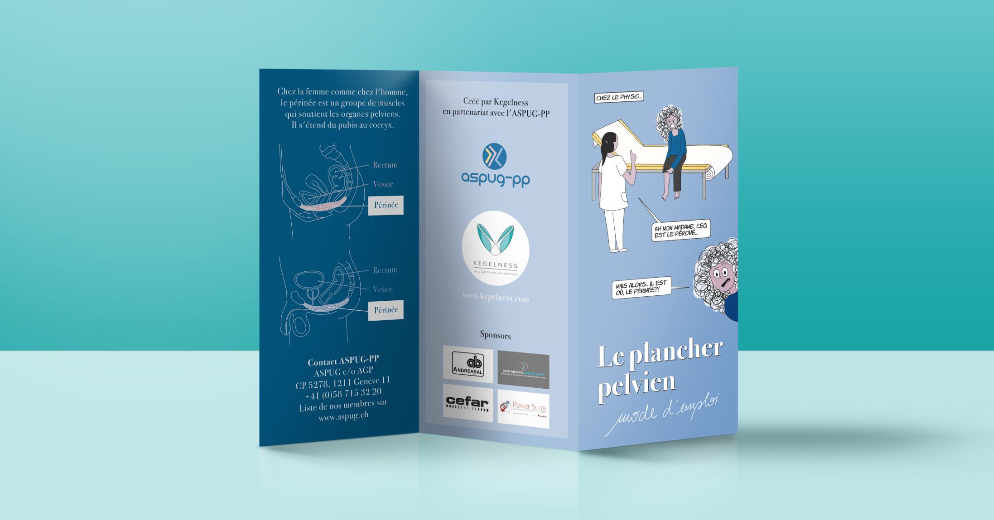
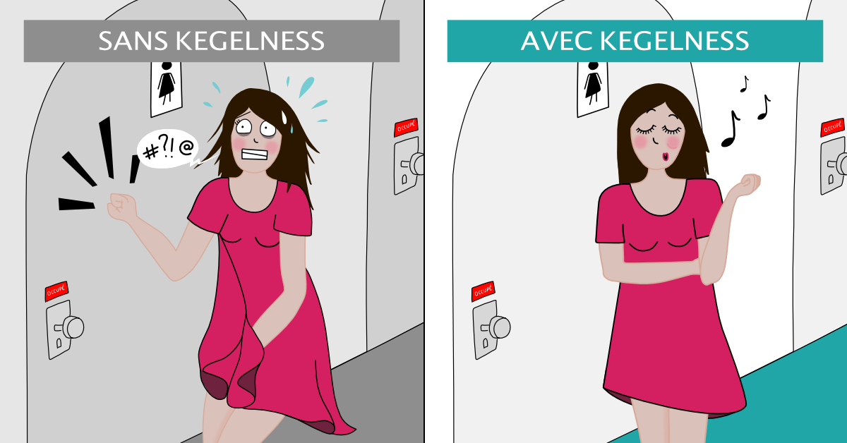
An exciting and ongoing collaboration that gave me the opportunity to dive into creative communication: I’ve created graphic design assets, custom characters, and comics too (have a look at “Le Plancher Pelvien“, an informative leaflet distributed at the Planète Santé 2018 expo in Geneva, Switzerland).




Comments (0)