Escalade Alsace is a project I had the pleasure of working on from multiple angles. My work ranged from visual identity to merchandising, calendar production, hardcover book design, and more.
Below is a selection of merchandising illustrations I developed around the logo I designed.
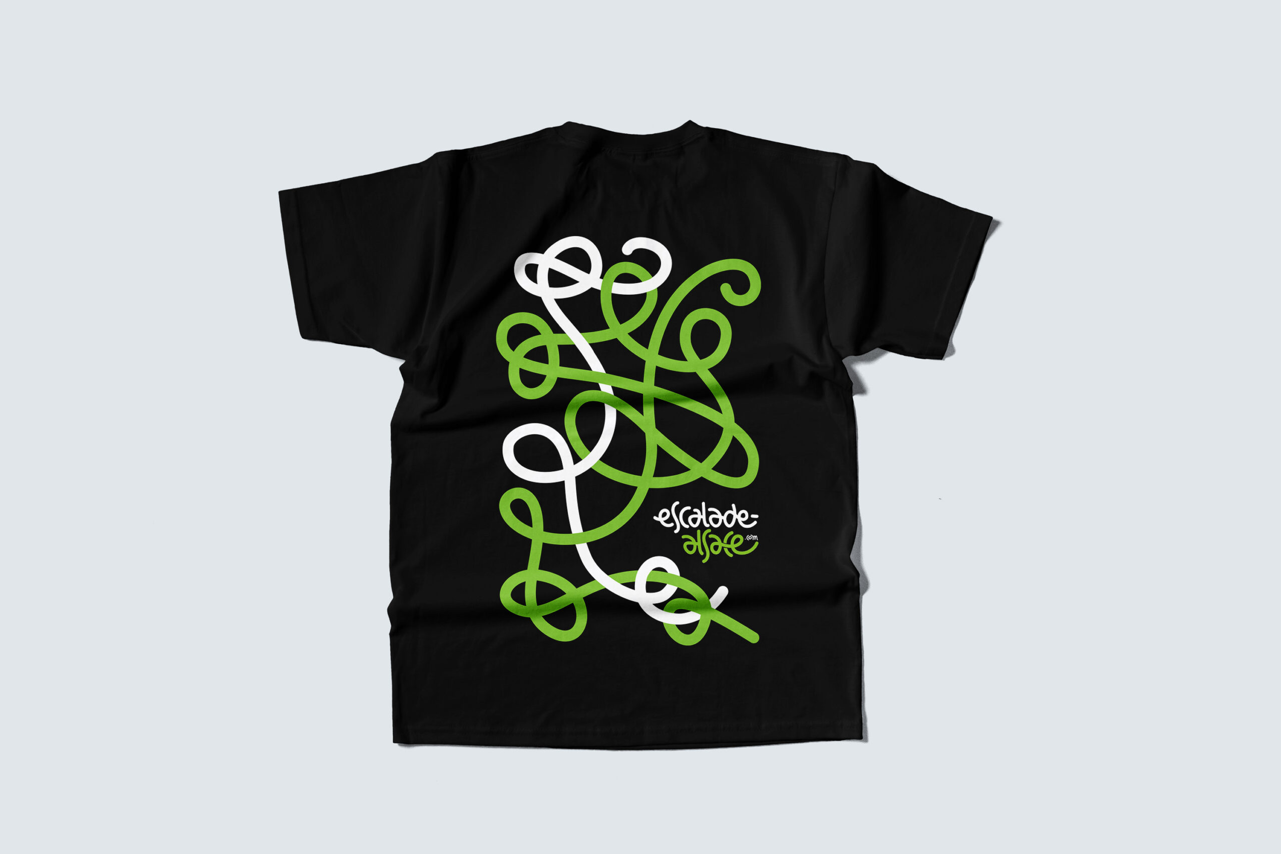
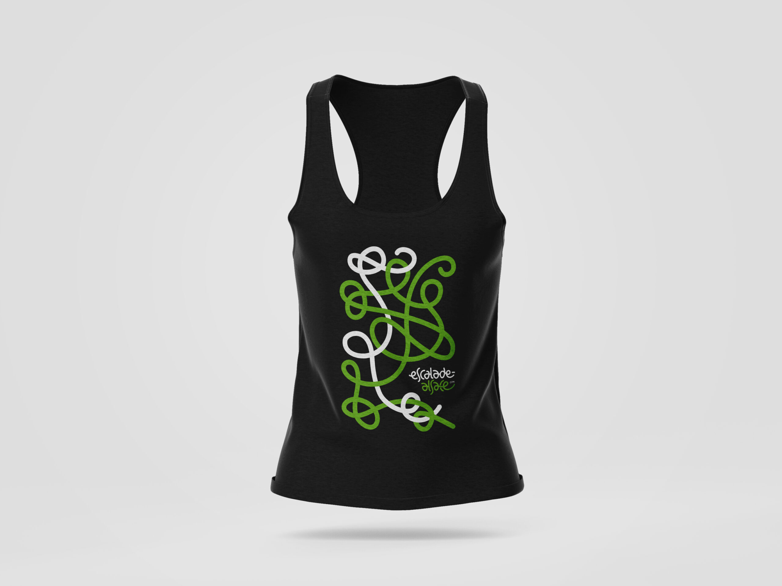
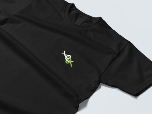
This first version is inspired by the logo itself, which was imagined as an intersection of climbing ropes creating the letters ‘e’ and ‘a’.
In this version, the letters intersect to form a figure-eight knot, and the rope continues to unfold, creating additional shapes—among them the bretzel, a well-known symbol of Alsace (where the association is based).
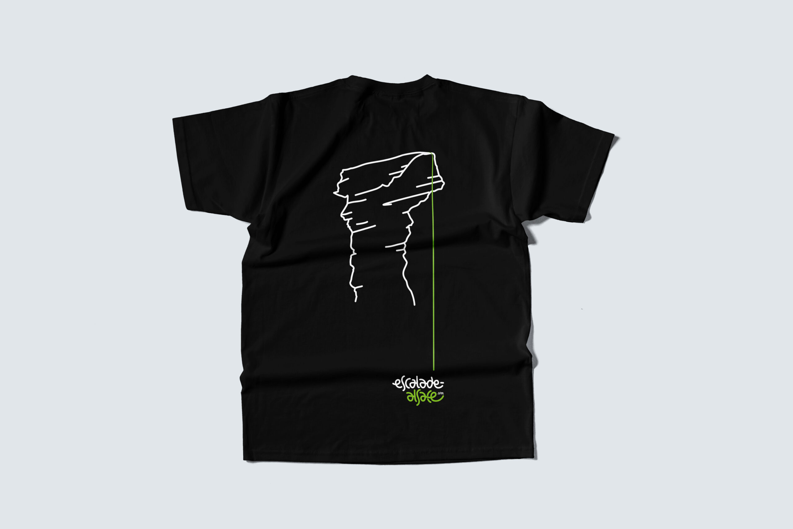
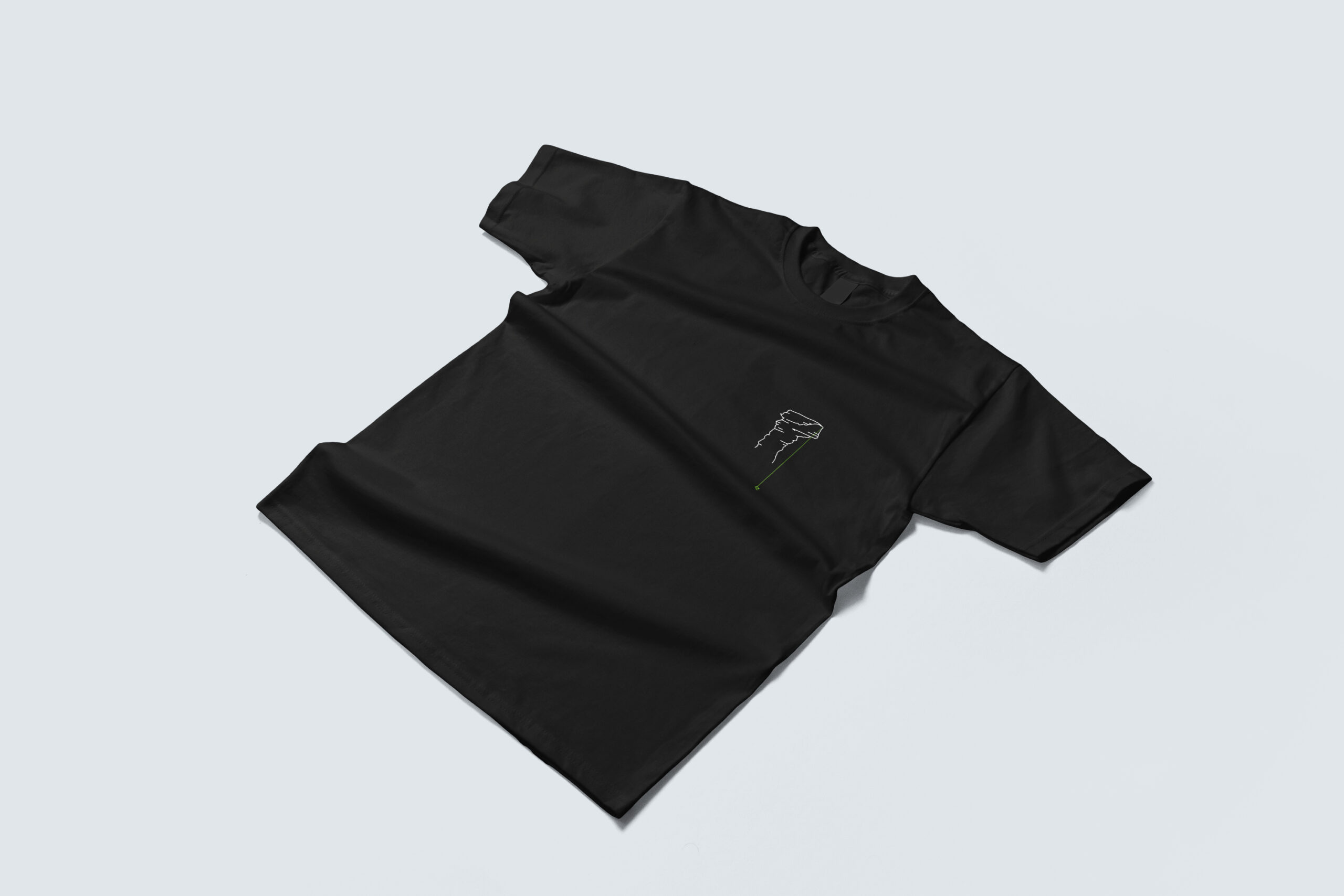
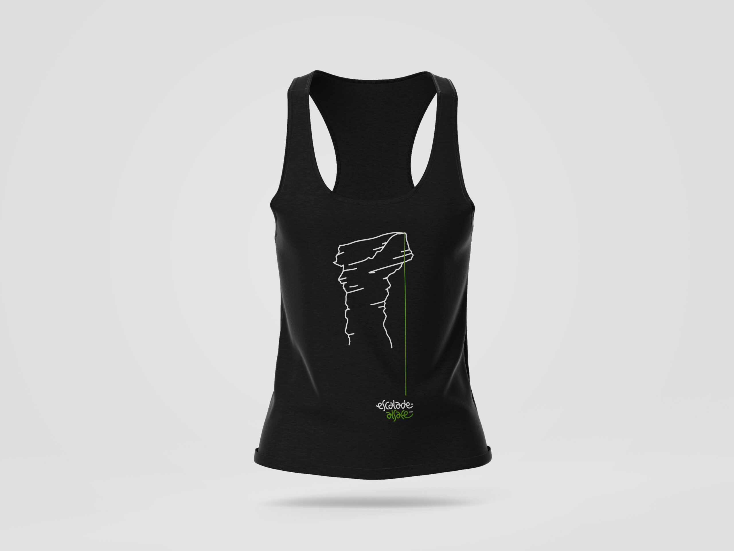
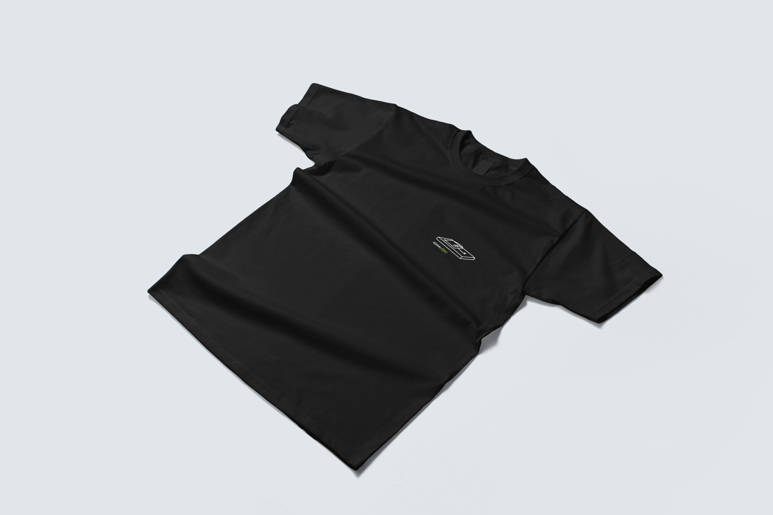
The second proposal is inspired by the typical sandstone towers that are popular climbing spots in Alsace.
The vertical rope connect the summit to the base, the rock to the logo, and balances the whole composition.
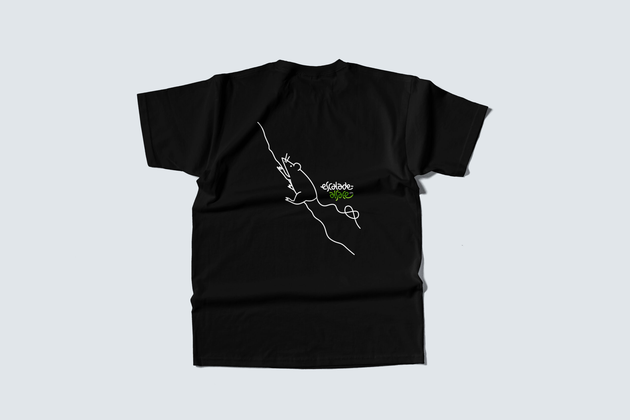
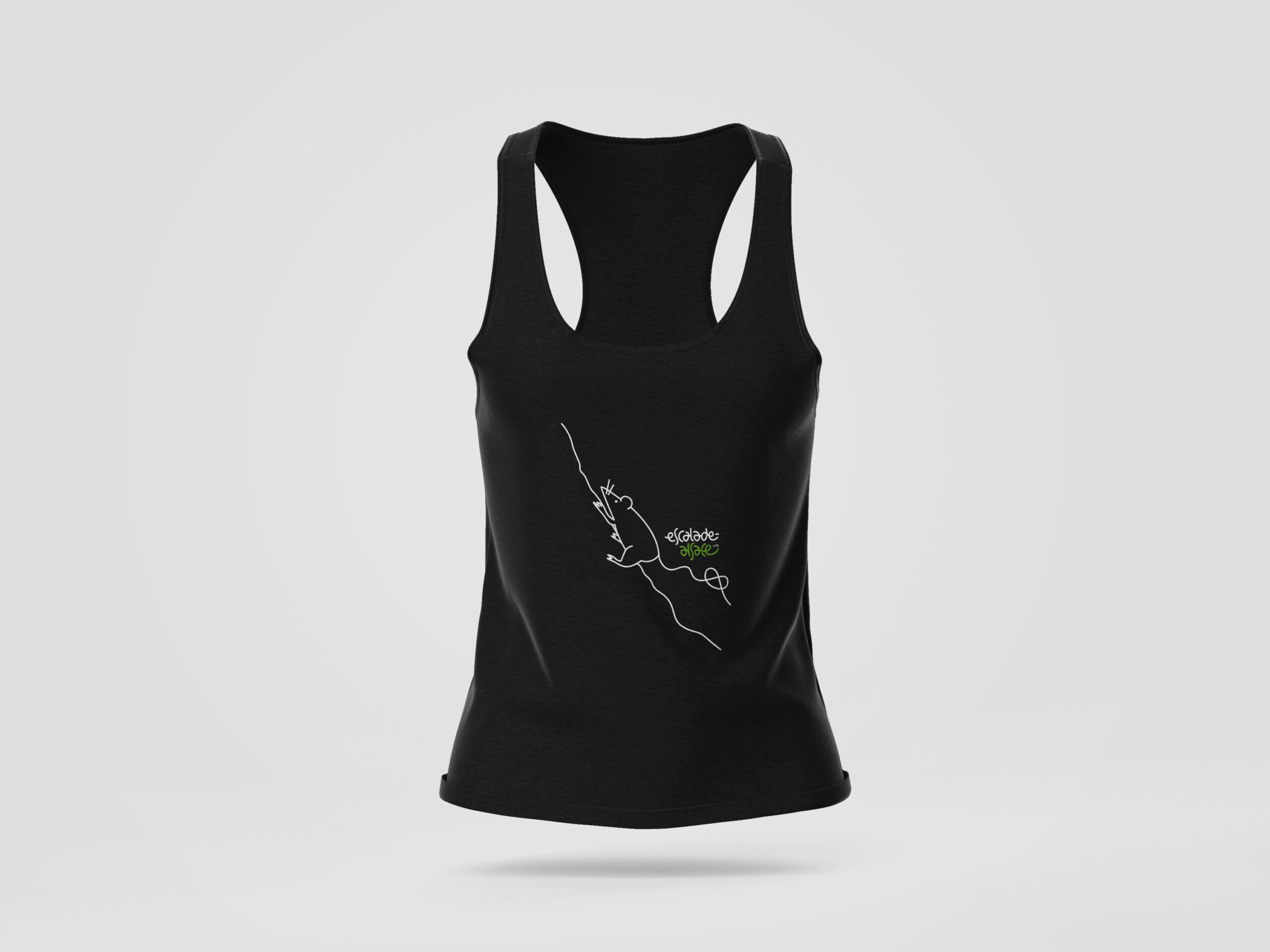
A third, more playful variant features a tiny mouse climbing up a wall on the back of the t-shirt, with its tail forming the popular bretzel shape.
This contrasts with the alternative illustration featured on the front 🙂
Related Projects
Escalade Alsace
A selection of merchandising illustrations derived from the logo and visual identity system I designed for the climbing association.
The Toy Library
End-to-end digital product build (Sharetribe, data, automations) and illustrated data visualisation to highlight the award-winning social enterprise's impact results.